Assignment - Coalescence
library("coala")
library("ape")
Q1.
Rebuild the same model, but this time explicitly set the ploidy to 2.
model <-
  coal_model(sample_size = 20,   # number of populations and individuals sampled
             loci_number = 50,   # number of loci
             loci_length = 1000, # length of each locus (bp)
             ploidy = 2) # Simulate 2 chromosomes (diploid) per individual
Q2.
How would you describe the length of the branches, especially the internal vs terminal branches? Give a general average observation (no need to measure each branch).
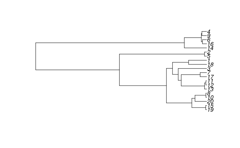
Overall, all of the internal branches are much longer than the terminal branches, although 1 and 18 have a fairly long terminal branch between the two of them, indicating that they did not have any recent coalescent events before the measurement.
Q3.
How would you describe the distribution of allele frequencies in general? In particular, how do the counts of low-frequency alleles (less than0.3) compare to those of more common alleles (greater than 0.3)?
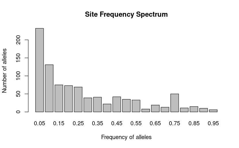
It seems that a lot more rare alleles are present in the population genome than common alleles, but not excessively (as we would expect in a recently expanding population after a bottleneck). This suggests that this population is stable/at equilibrium, as defined in our model.
Q4.
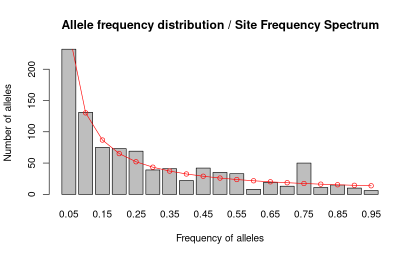
Do the observed SFS values (grey bars) match the expected values (red line)? If they differ, what might explain the differences?
Q5.
Across the repeated simulations, what varies (i.e., values on the x-axis or y-axis values)? Overall, do the observed SFS values approximate the expected neutral values on average?
When the coalescence simulation is repeated, the count of each observed allele frequency varies but the frequency values on the x-axis remain the same in each iteration. Each simulation varies around our expected value, the actual SFS counts are either slightly higher or lower than the expected value - on average they approach the expected value.
Q6.
What is the median Tajima's D value obtained during the simulation? You can use the function median() to find the exact answer.
Using the median(tajima_100_simulations) function we get the value
Q7.
What does the Tajima's D distribution tell us about the demography of the simulated population (if we assume there is no selection)?
Assuming there is no selection (neutrally evolving population), a Tajima's D value close to zero (as shown on our boxplot) indicates that the population is stable. Both of these are consistent with our model parameters of no population change or selection.
Q8.
What is the median value or nucleotide diversity
Our median nucleotide diversity is
Q9.
How does this value relate to the parameters used in the model?
The median
The median number of distinct nucleotides per locus is close the the average number of mutations per locus. On the boxplot it is clearly visible that five is within our inner quartiles, and this difference is likely mostly due to stochasticity. If we increase the number of simulations or the number of generations per simulation we expect this value will get closer to 5.
Q10.
What differences do you see between the SFS produced with a model of a growing population compared to those obtained with a model of a stationary population? Tip: use the red line (expected values) to guide your answer.
We can clearly see from the plots that the growing population produces a plot that differs greatly from our expected values than from our stationary model. Specifically, the genome contains much more rare alleles and much fewer common alleles.
Q11.
How does the proportion of rare alleles (i.e., alleles with small allele frequencies, e.g., less than 0.2, on the left side of the plots) vary between the two models? What about the proportion of more common alleles (right side of the plots)?
In the growing population, there are higher counts of rare alleles and almost no alleles common to the whole population. Since our simulation specified that there should be five mutations in the entire simulation, and a growing population produces more lineages, but only twenty were sampled at the end, each sampled individual is less likely to share these mutations with another one that was sampled. Therefore, there are more rare mutations in the genome.
Q12.
What differences do you see in the genealogies obtained from a coalescent model of a growing population compared to those from a model of a stationary population (focus on the length of the terminal branches in each model)? In which model are the terminal branches longer relative to the entire tree? Why?
Based on my plot of the two together (code below), the stable populations typically have much longer internal branches and short terminal branches, while the growing populations have pretty long terminal branches, often the same length or longer than the internal branches.
This is consistent with what we expect for an expanding population with the same total number of mutations as a stable population - since there are more possible recombination events, there is more distance between each sampled individual and its common ancestor with another sampled individual, making the terminal branches longer.
par(mfrow = c(2, 3))

# Plot 3 stable model simlulated trees
for (i in 1:3) {
  plot(read.tree(text = simulate(model)$trees[[1]][1]),
  main = paste("Gene genealogy Stable", i))
}

# Plot 3 growth model simulated trees
for (i in 1:3) {
  plot(read.tree(text = simulate(model_growth)$trees[[1]][1]),
  main = paste("Gene genealogy Growth", i))
}
Q13.
How does the distribution of Tajima’s D produced with a model of a growing population compares to the one produced with a model of a stationary population?
Using the code below, I plotted the boxplots of the Tajima's D distribution in the stable and growing populations. This showed how the distribution of Tajima's D in the growing population is centered around -1.1, much lower than the values seen in the stable population. This is consistent with what we would expect for a growing population with no selection.
# to have one plot on the top of the other, you can use this as well:
par(mfrow = c(2, 1))

# Code for the Tajima's D boxplots, here:
# stationary population model
tajimas_d_stable <- simulate(model)$tajimas_d
boxplot(tajimas_d_stable, na.rm = T, horizontal = T,
  main = "Distribution of Tajima's D in a stable population")


# population growth model
boxplot(tajimas_d_growing, na.rm = T, horizontal = T,
  main = "Distribution of Tajima's D in a growing population")
Q14.
How does the
Despite both populations having a per locus mutation rate of 5, the growing population has a nucleotide diversity much closer to 0.5, ten times less than the overall mutation rate. This is expected since a growing population contains the same amount of mutant alleles in a larger population, so when comparing between many individuals the number is less.
My Model
# Using most of the same parameters from the growing population:
model_decline <-
  coal_model(sample_size = 20,
             loci_number = 100,
             loci_length = 100) +
  # The population was stable for some time then declines 50-fold
  feat_growth(rate=0, population=1,time = 0.5)+
  feat_growth(rate=-10, population=1 ,time = 0)+
  feat_mutation(5) + # no need to add "IFS", as it is the default option
  sumstat_trees() +
  sumstat_sfs() +
  sumstat_nucleotide_div() +
  sumstat_tajimas_d()
Q15.
What trend do you observe in the site frequency spectra of a coalescent model of population with a declining effective size? To support your comparison, compare the site frequency spectra simulated to the expected using the same approach as during the study of a model of a growing population.
# This is to get 2*3 plots together
par(mfrow = c(2, 3))

expected_standard <-
  function(sfs) {
  sum(sfs) * (1 / seq_along(sfs)) / sum((1 / seq_along(sfs)))
    }

for (i in 1:6) {
  # The same for loop as before
  sim_sfs <- simulate(model_decline)$sfs

  x_arg <- seq_along(sim_sfs) / (max(seq_along(sim_sfs)) + 1)
  expected_counts <- expected_standard(sim_sfs)

  # replot the bar plot
  df.bar <- barplot(sim_sfs, names.arg = x_arg, main = paste("SFS", i),
                    xlab="Frequency of alleles",
                    ylab="Number of alleles")

  # add points and lines in red of the expected
  points(x = df.bar, y = expected_counts, col = "red")
  lines(x = df.bar, y = expected_counts, col = "red")
}
As expected, my model which simulated a period of stable population followed by a period of decline had generally fewer low-frequency alleles and more high-frequency alleles than the expected standard amounts from a stagnant population.
Q16.
How do genealogies of loci sampled in a declining population tend to differ from those sampled in a stationary population? Remember to look at length of terminal and internal branches. To help you, try to plot genealogies simulated under a neutral model and in the same plot genealogies under a model of a collapsed population.
par(mfrow = c(2, 3))

# Define standard model
model <-
  coal_model(sample_size = 20,   # number of populations and individuals sampled
             loci_number = 50,   # number of loci
             loci_length = 1000) + # length of each locus (bp)
  feat_mutation(5, model = "IFS") +
  sumstat_trees() +
  sumstat_sfs() +
  sumstat_nucleotide_div() +
  sumstat_tajimas_d()

# Plot 3 stable model simulated trees
for (i in 1:3) {
  plot(read.tree(text = simulate(model)$trees[[1]][1]),
  main = paste("Gene genealogy - stable", i))
}

# Plot 3 growth model simulated trees
for (i in 1:3) {
  plot(read.tree(text = simulate(model_decline)$trees[[1]][1]),
  main = paste("Gene genealogy - declining", i))
}
In declining populations, the terminal branches are very short and the internal branches are much longer, relative to the stable population. This is because each individual must have had a very recent common ancestor with its closest sampled relatives, since many lineages have died out as the population declines.
Q17.
What is the median value of Tajima’s D computed over 20 samples and 100 loci of length 100 simulated using a coalescent model of a declining population, with a mutation rate of 5?
# Using most of the same parameters from the growing population:
model_17 <-
  coal_model(sample_size = 20,
             loci_number = 100,
             loci_length = 100) +
  # The population was stable for some time then declines 50-fold
  feat_growth(rate=0, population=1,time = 0.5)+
  feat_growth(rate=-10, population=1 ,time = 0)+
  feat_mutation(5) + # no need to add "IFS", as it is the default option
  sumstat_nucleotide_div() +
  sumstat_tajimas_d()

# Let's run 100 simulations (nsim=100) and assign the results to a variable
stats_100_simulations <- simulate(model_17, nsim = 100, seed = 20)

# Extract the D statistics (Tajima's D) in a matrix of 50 rows and 100 columns
tajima_100_simulations <- sapply(stats_100_simulations, function(x) x$tajimas_d)

median(tajima_100_simulations)
The median Takima's D value is given above (It should be close to
Q18.
What is the median value of π computed over 20 samples and 100 loci simulated using a coalescent model of a declining population, with a mutation rate of 5?
# Also extract the nucleotide diversity (pi) values
pi_100_simulations <- sapply(stats_100_simulations, function(x) x$pi)
median(pi_100_simulations)
The median nucleotide diversity is given above (it should be close to
Q19.
Imagine that you were given DNA polymorphism on 20 samples of Pinus sylvestris and, using that genetic material, you computed a Tajima’s D of -1.6. Based on all the simulations you did today, what would be your guess on the recent demographic history of the population you had samples from? Is there an alternative explanation for observing such value of Tajima’s D?
Based on the reults I received today, I would think this value is closest to our model of a growing population founded from one source, although I would need to do a statistic test compared with a simulated population with the same parameters to make sure.
An alternative explanation is that there is positive selection happening for the alleles we are measuring frequency of - perhaps they are important for a certain beneficial mutation in this population, like an adaptation to climate change.